The Kurtz Graphic Design Co. Transforming Small Businesses Into Big Brands
Case Studies
Services
Process
Who We Serve
About
Book A Call
Blog
Table of Contents
General Interest
Architecture
Art
Comics
Furniture
Games
Humor
Industrial Design
Legal
Movies
Music
Odd and Interesting
Popular Culture
Science
Self Improvement
Sports
Technology
Graphic Design
Graphic Design History
Graphic Design Principles
Graphic Design Rockstars
Logo Design
Topics of Interest
Typography
The Graphic Design Textbook
Graphic Design in Theory
Graphic Design Theory
The Kurtz Graphic Design Co.
About Us
Happenings At The Office
Our Work
Uncategorized
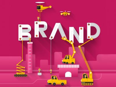
When is the Best Time to Consider Rebranding?
August 11, 2021
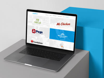
We’ve Updated Our Website! Let Us Show You Around
June 18, 2021
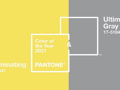
Pantone Color of The Year 2021
December 16, 2020
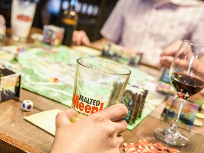
The Malted Meeple Website Redesign
July 30, 2020
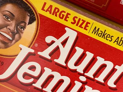
Rebranding Racist Stereotypes
July 1, 2020
How to Make Your Brand Logo into a Cookie
December 23, 2019
Hudson Christkindlmarkt Logo
December 13, 2019
New Projects in Our Portfolio!
August 16, 2019
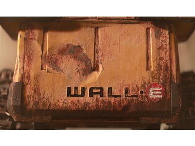
Typeset In The Future: WALL·E
May 3, 2019
1
2
3
4
...
CONTACT US
[contact-form-7 id="24" title="Contact form 1" html_id="WPF7"]
330.653.5370
43 Village Way, Suite 210
Hudson, Ohio 44236