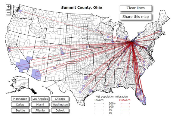
Interactive Migration Map

Even though I have put Forbes "on notice" Stephen Colbert style. They do have a pretty slick info-graphic/map documenting where people moved within the United States.
More than 10 million Americans moved from one county to another during 2008. The map below visualizes those moves. Click on any county to see comings and goings: black lines indicate net inward movement, red lines net outward movement.
Check it out at Forbes
I would like to see the age range as well. I would guess a lot of those moving to Florida are retired, while most to California are out of high school or college.
Valuable info. Lucky me I found your site by accident, I bookmarked it.