Top-tier ADA tile manufacturer seeks top-tier branding
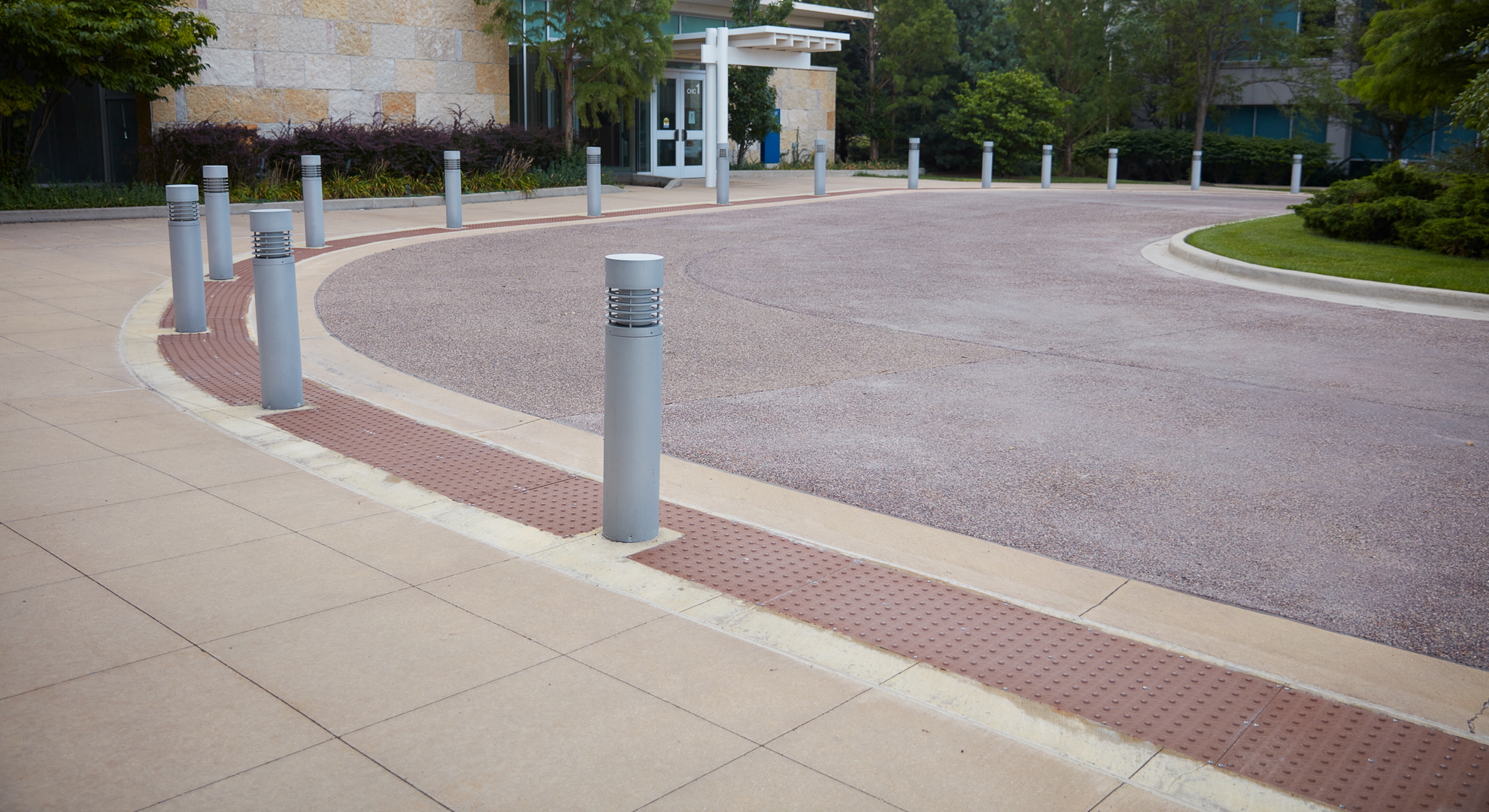
You’re about to cross the street. As you approach the crosswalk, you notice a colorful tile set in the pavement leading to the road. It’s yellow, gray, or maybe brick red, with a uniform pattern of raised dots. What is it? It’s an ADA detectable warning tile. These tiles are mandated by the Americans with Disabilities Act to protect the visually impaired.
TufTile is a leading American manufacturer of ADA tiles. They’re an American owned and operated company and the only ADA tile manufacturer that makes their high-quality products in-house, no outsourcing.
TufTile came to KURTZ for help with their brand identity.
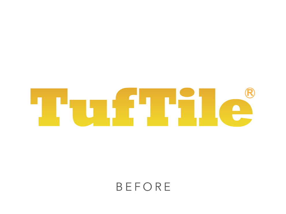
They didn’t have a creative team, and over the years, TufTile’s engineers had cobbled together a logo and other marketing materials. But the TufTile brand needed consistency and brand recognition.
the TufTile brand needed consistency and brand recognition
TufTile’s products inspire logo design and color scheme
TufTile’s branding didn’t match their premium products. They wanted branding that would set them apart, but they didn’t want to move too far from their original logo since each of their products is stamped with it.
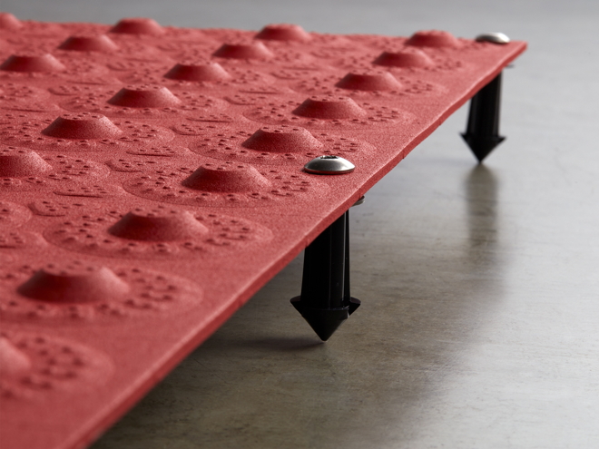
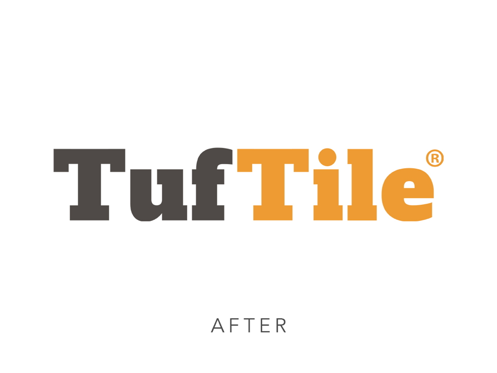
With TufTile’s objectives in mind, we designed their new logo to mirror their products. Their ADA tiles are geometrically perfect, each raised dot in alignment with the one above, below, and beside it.
So we set the logo in a geometric typeface, the underside of each capital T aligning with the top of the lowercase letters. The i is dotted with a perfect circle, like the raised dots on the tiles.
Their new logo strikes a fine balance and shows a clear evolution from the original.
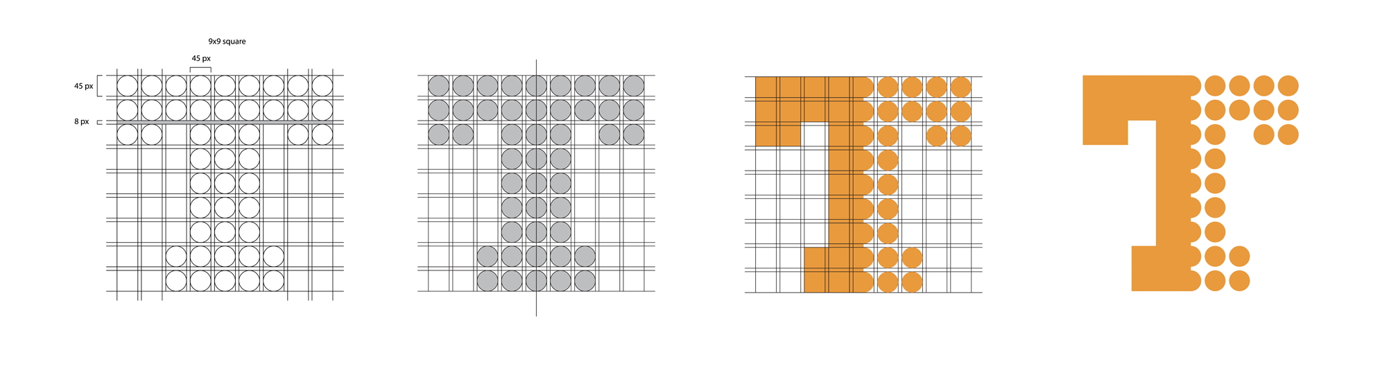
We then created a memorable icon, featuring a capitalized T. The left side of the T is solid, and the right side is composed of perfect circles.
TufTile loved the logo and icon so much they had company shirts made, embroidered with the design.
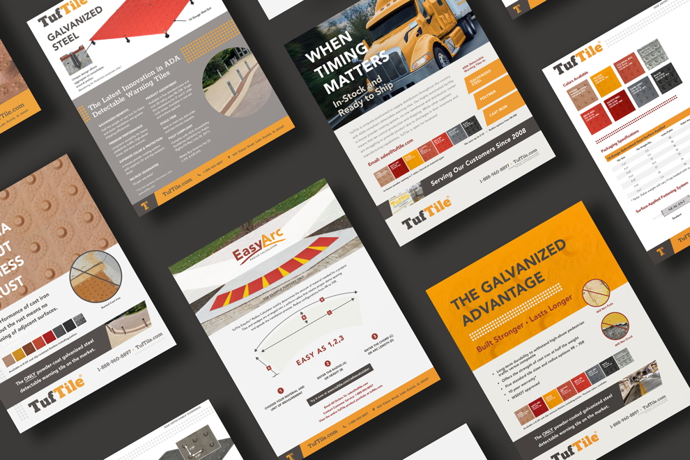
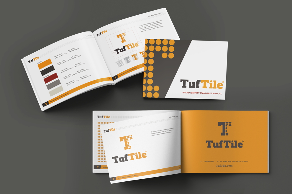
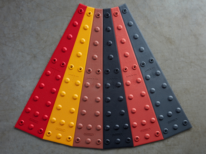
Next, we developed TufTile’s color palette. We wanted to move away from the overdone yellow-and-black color scheme. Instead, we sought inspiration from TufTile’s very own products, which come in a variety of colors, including dark gray, brown, yellow, and deep reds. Sticking close to those colors, we created a memorable color scheme that tells the brand’s story and looks great on screens and paper.
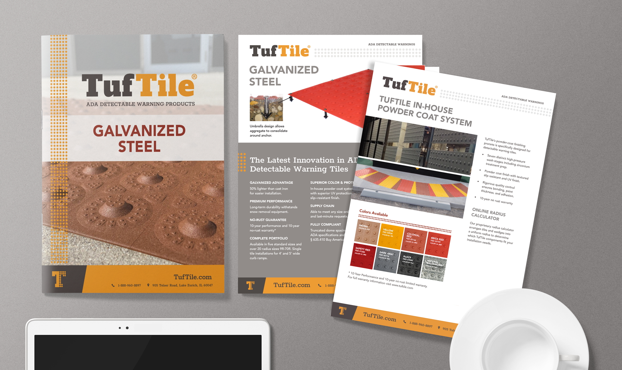
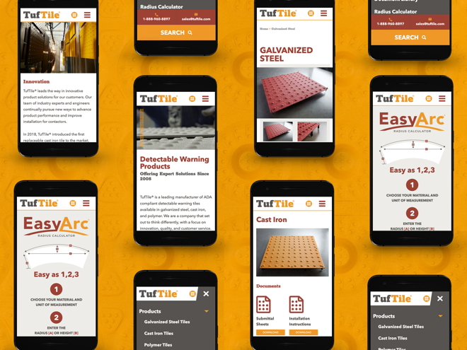
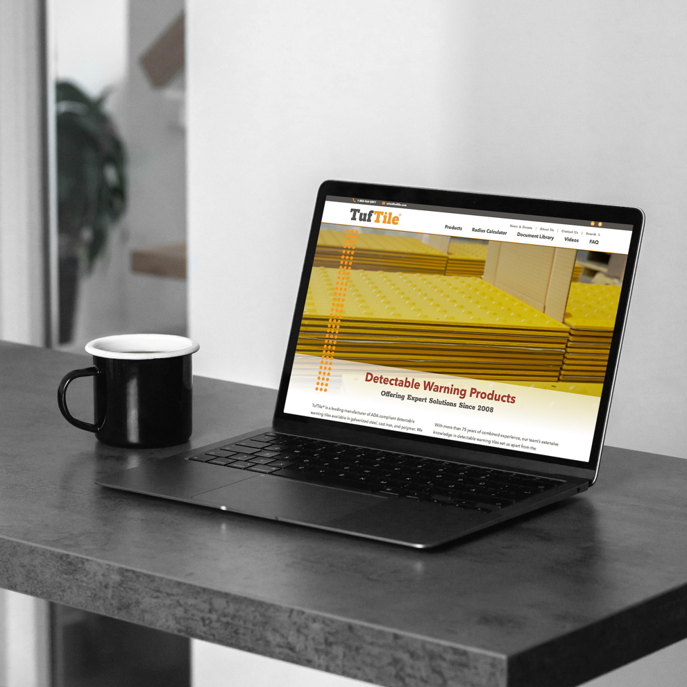
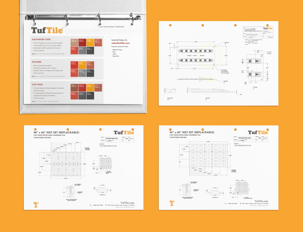
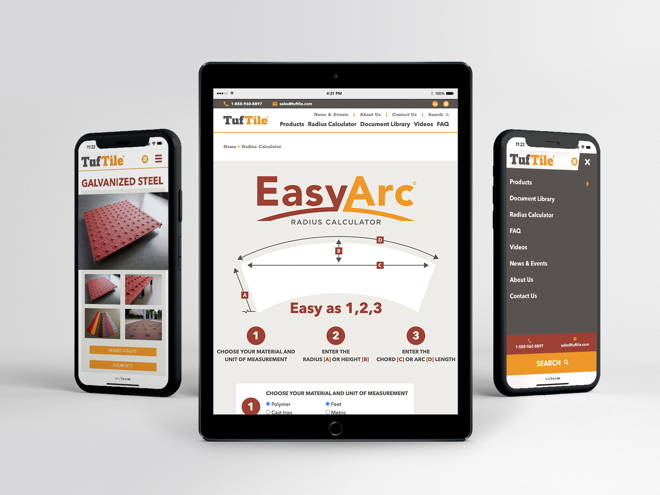
With the color palette and logo defined, we then created sell sheets, letterhead, PowerPoint templates, full-page ads for trade publications, flyers, a website, and more.
TufTile is galvanized by rebranding
With a fresh brand identity and a powerful new website, TufTile feels reinvigorated.
They’re ready to break new ground in their industry and at a crosswalk near you. The next time you cross the street, check the ADA tile for the TufTile logo.
Lorem ipsum dolor sit amet, consectetuer adipiscing elit commodo ipsum sed phar id pulvinar odio non turpis.
“ ”
Firstname Last Name, Title
TufTile