Demand for premium products requires a larger operation
Jeff and Melanie Brunty of Brunty Farms had been selling their pasture-raised eggs and meats direct from their farm for 15 years. When demand increased, they realized they needed to scale their operation to continue providing customers with the highest-quality products.
So in 2018, The Farmer’s Rail, Artisanal Meats & Butcher Shop, opened its doors to do just that.
But first, the Bruntys came to us in need of branding that would speak to consumers with refined tastes, who appreciate craftsmanship and are willing to pay for it.
They also wanted to highlight their butcher shop’s unique origins in Brunty Farms. Likewise, they wanted to call back to classic butcher shops, with a mom-and-pop feel, while staying modern.
Fusing a Sustainable Farm with an Artisanal Butcher Shop
Filet mignon branding for a premium butcher shop
Combining classic and contemporary, farm with upscale, might sound contradictory, but after our discovery session with the Bruntys, we knew we could deliver what they were looking for.
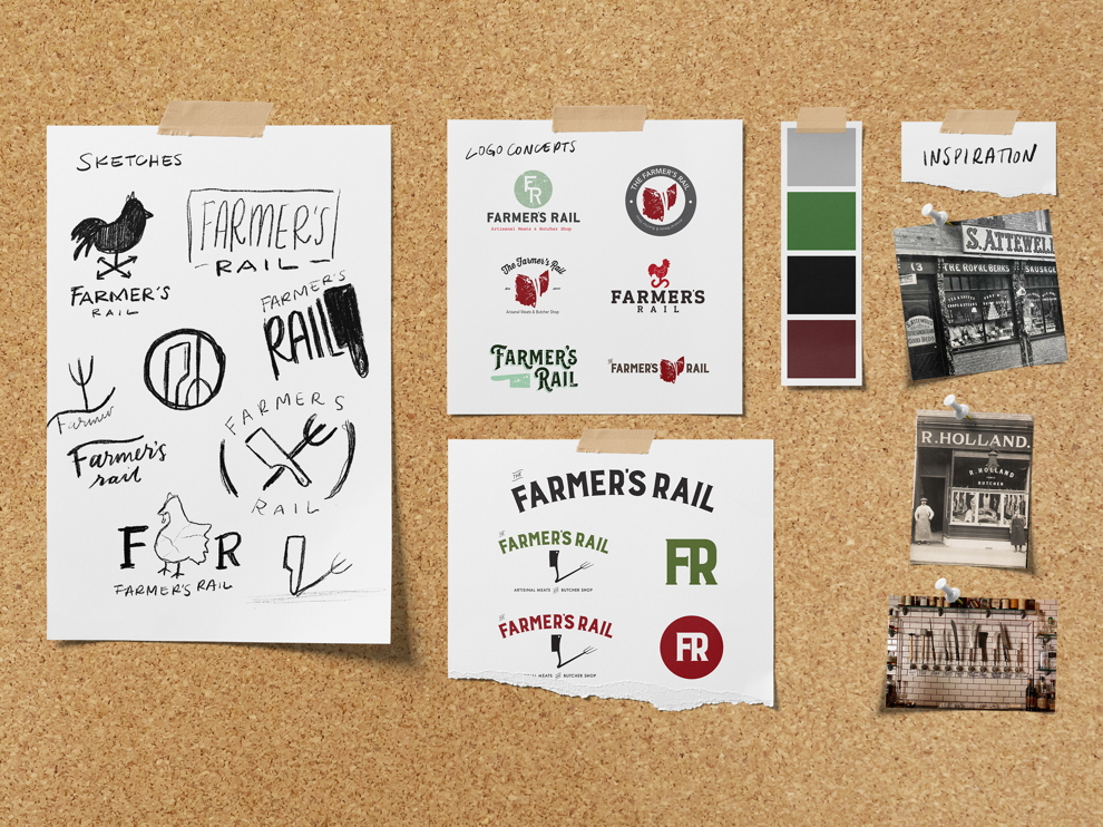
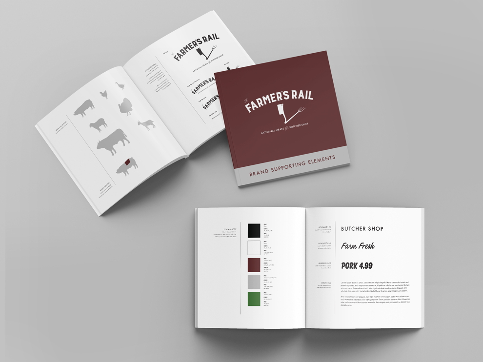
Our first task was to design a logo and brand identity that would connect The Farmer’s Rail to its beginnings at Brunty Farms. The logo needed to show that The Farmer’s Rail is a farmer-owned butcher shop dedicated to offering small-batch quality over mass-produced quantity.
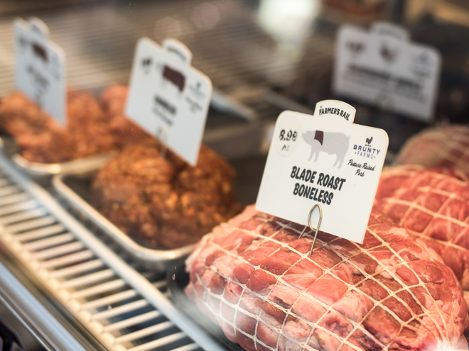
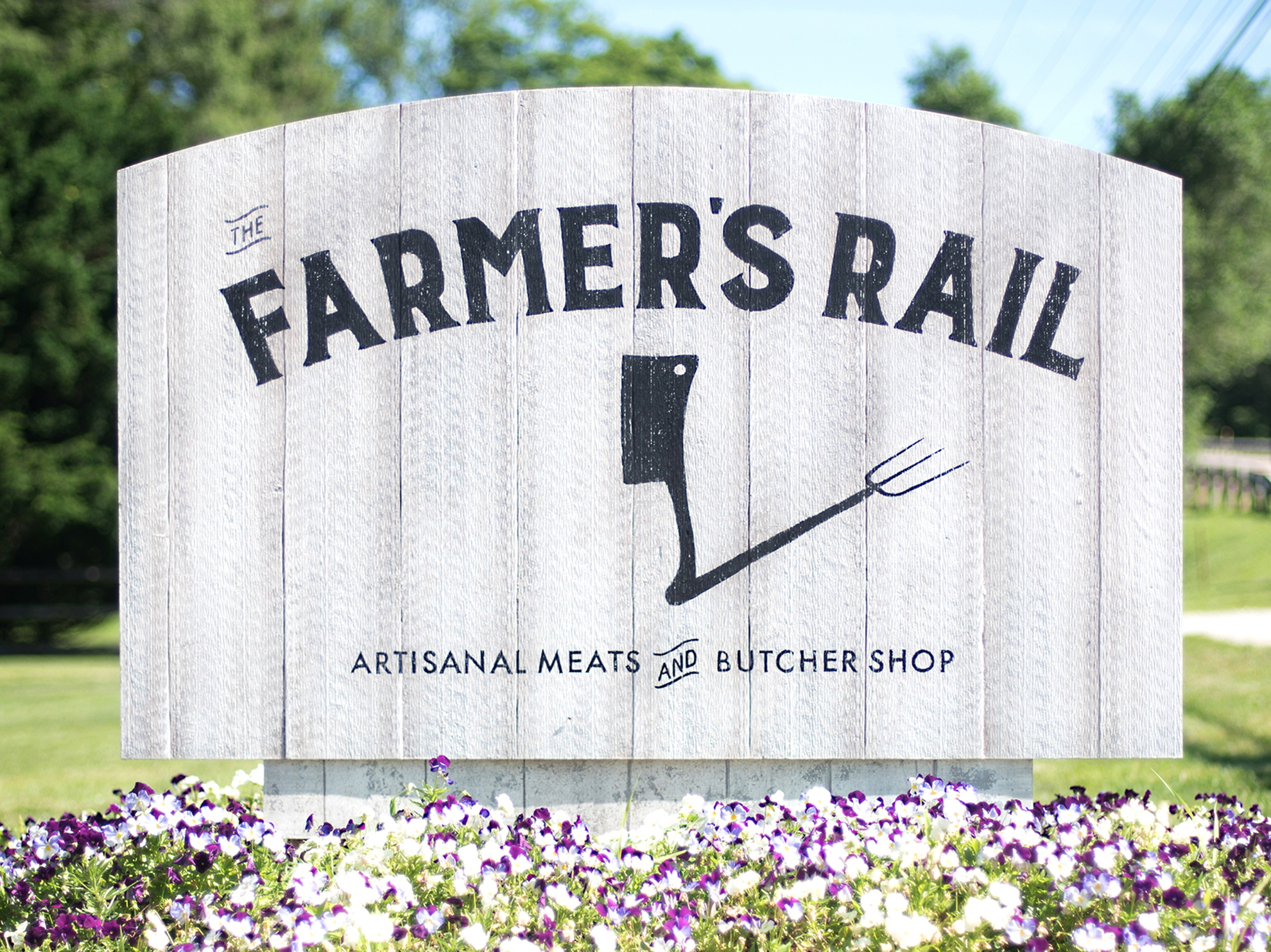
To that end, we designed a classic black-and-white logo incorporating a cleaver and a pitchfork. The cleaver stands upright casting a pitchfork-shaped shadow, suggesting the shop’s farm origins.
The name “Farmer’s Rail” curves above this icon in straightforward, bold lettering recalling the storefront signage of a classic main-street shop.
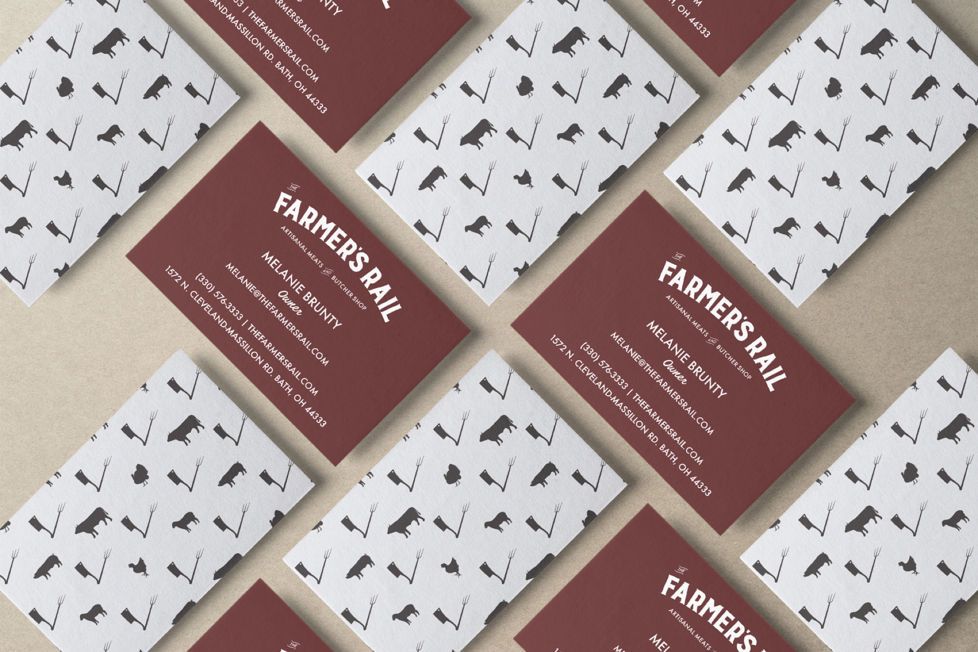
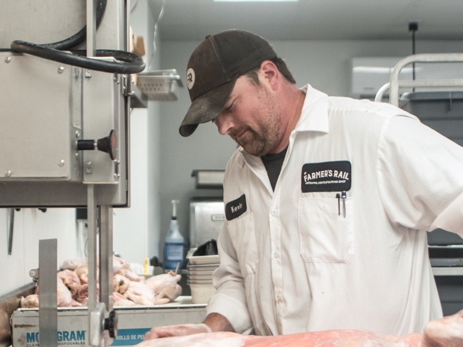
Around the brand identity and logo, we designed business identity items like business cards, uniforms and apparel, and patterns to be used on custom butcher paper.
We also consulted on architectural and interior decorating matters to ensure that customers’ interaction from entrance to exit is consistent.
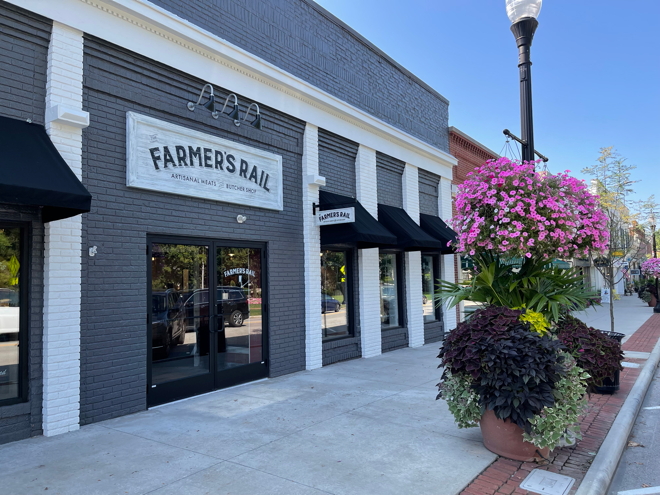
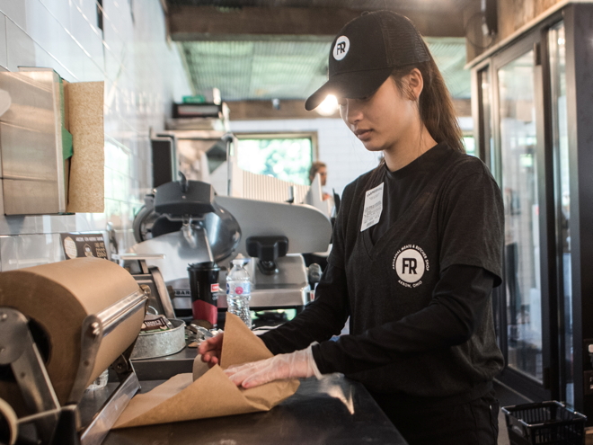
When the customer enters the shop, they’re greeted by brand-specific graphics. At the counter, they see a matching wall logo. The employees are dressed in coordinating uniforms bearing the new logo. Even the products behind the counter are labeled with matching signage.
At every point, the customer experiences consistency and feels secure in patronizing a well-established brand.
From roadside sign to storefront, from entrance to exit, each point of contact tells the same story.
It was crazy trying to coordinate everything that goes into opening a store, but you guys made this aspect so easy. Thank you, KURTZ!
“ ”
Melanie Brunty, Owner
The Farmer's Rail
Highly successful launch leads to new locations
With their new branding in place and a high level of brand awareness, The Farmer’s Rail had a highly successful launch. And the hype has not died down.
In fact, their first butcher shop has been so popular that Jeff and Melanie have decided to expand and are opening two additional locations in nearby towns.