Rebranding to match public image with quality of work
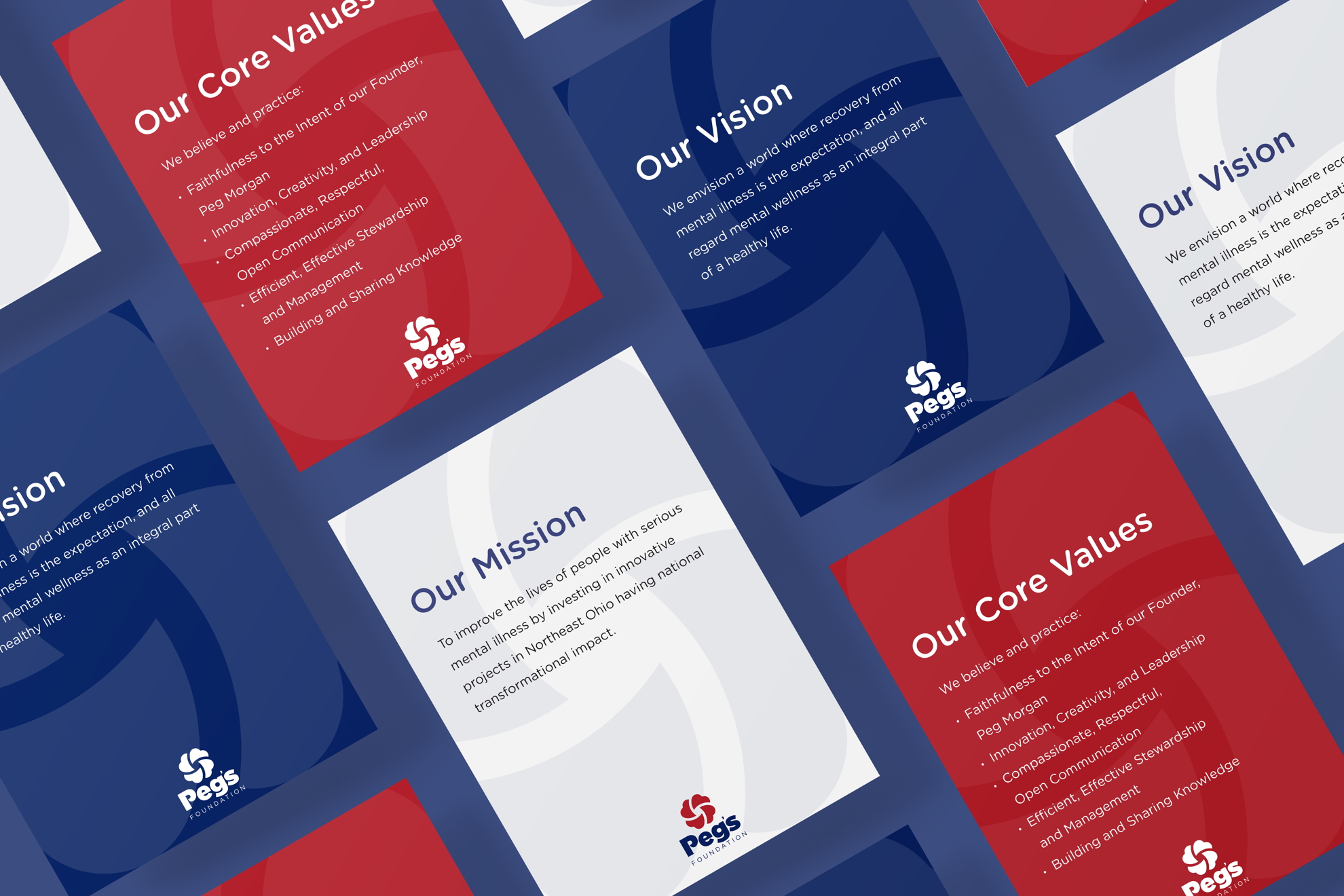

Rebranding the Margaret Clark Morgan Foundation with a Focus on the Founder, Peg Morgan
The foundation does incredible work, but their branding wasn’t on equal footing with the branding of the larger organizations they partner with. Their image was important because though they fund local projects, they have a national reach and lots of exposure.
The foundation also needed to distinguish itself from another philanthropic organization in the area using the Morgan family name.
Building the brand around Peg
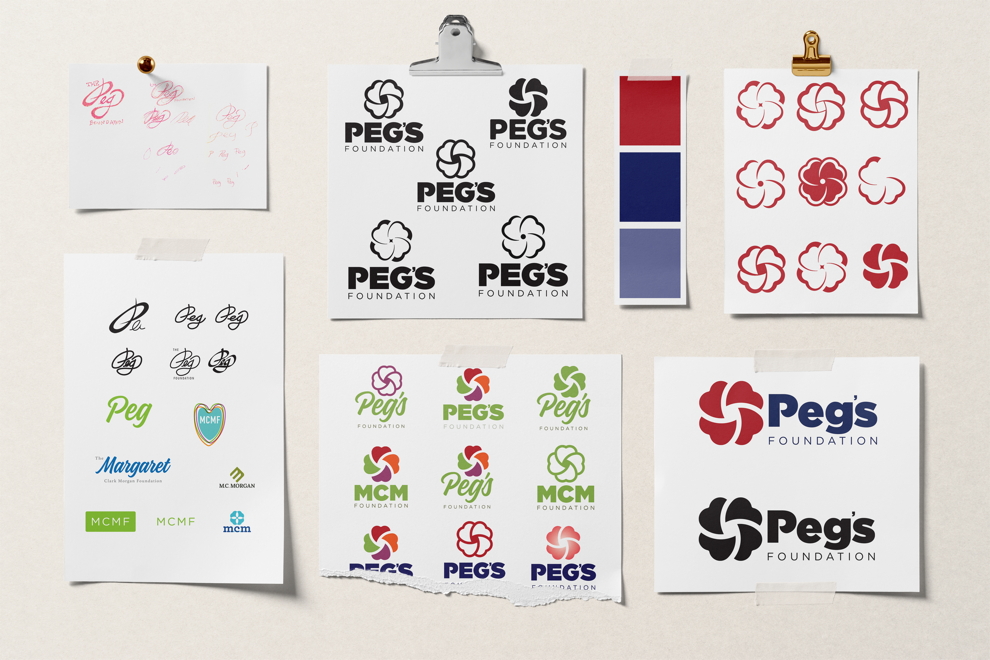
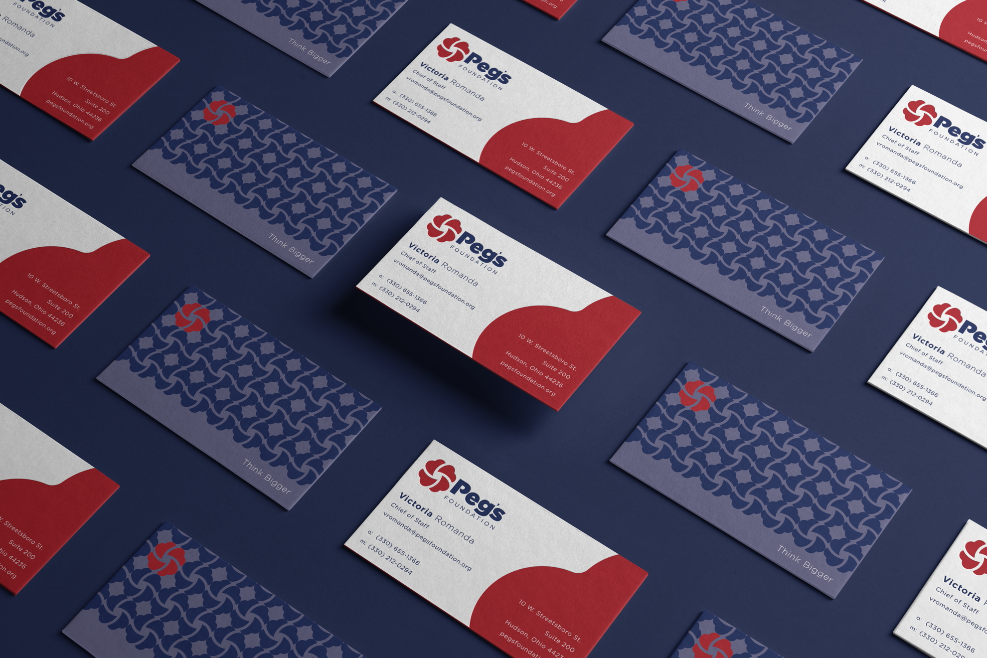
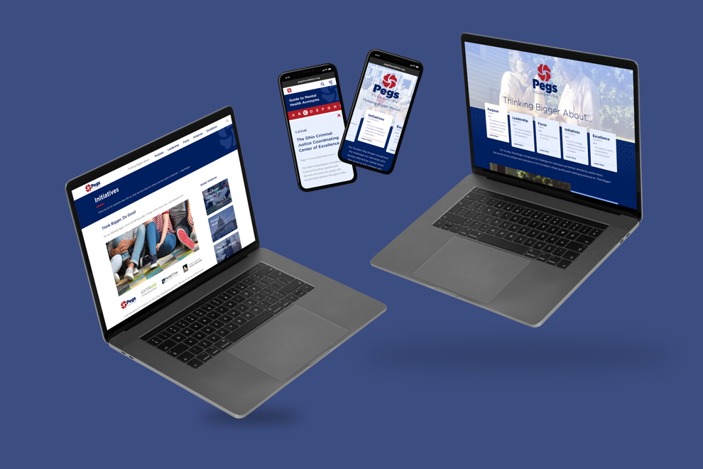
To achieve the foundation’s goals, KURTZ constructed a new brand identity around Peg. Close friends and family always called her Peg, not Margaret, so for a more familiar and welcoming feel, we renamed it Peg’s Foundation. The name keeps the founder front and center and avoids any confusion with other Morgan family organizations.
According to Victoria Romanda, chief of staff for Peg’s Foundation, “this change accurately represented our founder’s personality and the culture of the foundation.”
Next, we revamped the original logo to fit the direction of the new brand. The new logo is modern and bold and features Peg’s favorite flower, the American dogwood. Peg also inspired the tagline.
When asked how to change the way we talk about and treat mental illness, she would say we need to think bigger. “Think Bigger” fits perfectly with an organization that funds local projects with a national impact.
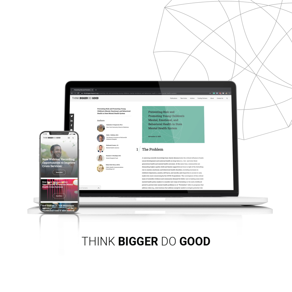
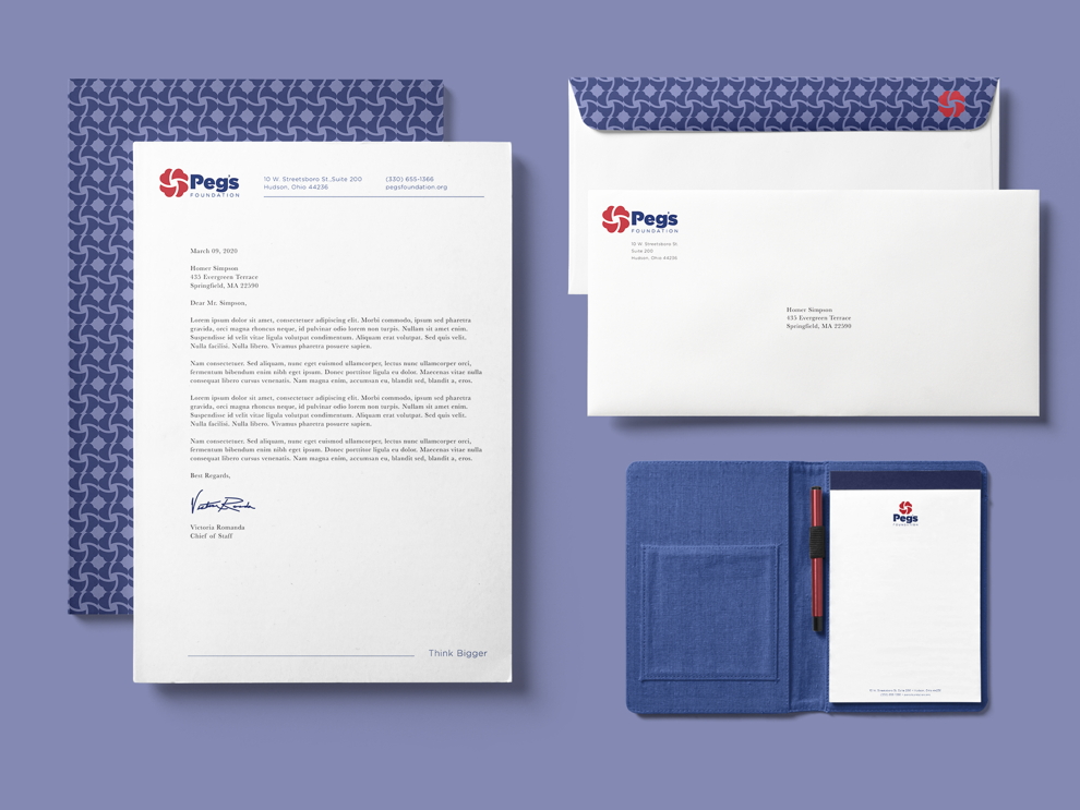
Around the new name, logo, and tagline, we built a visual identity to match the innovative work Peg’s Foundation does. We created a comprehensive business identity system and redesigned their website, email campaigns, and ads.
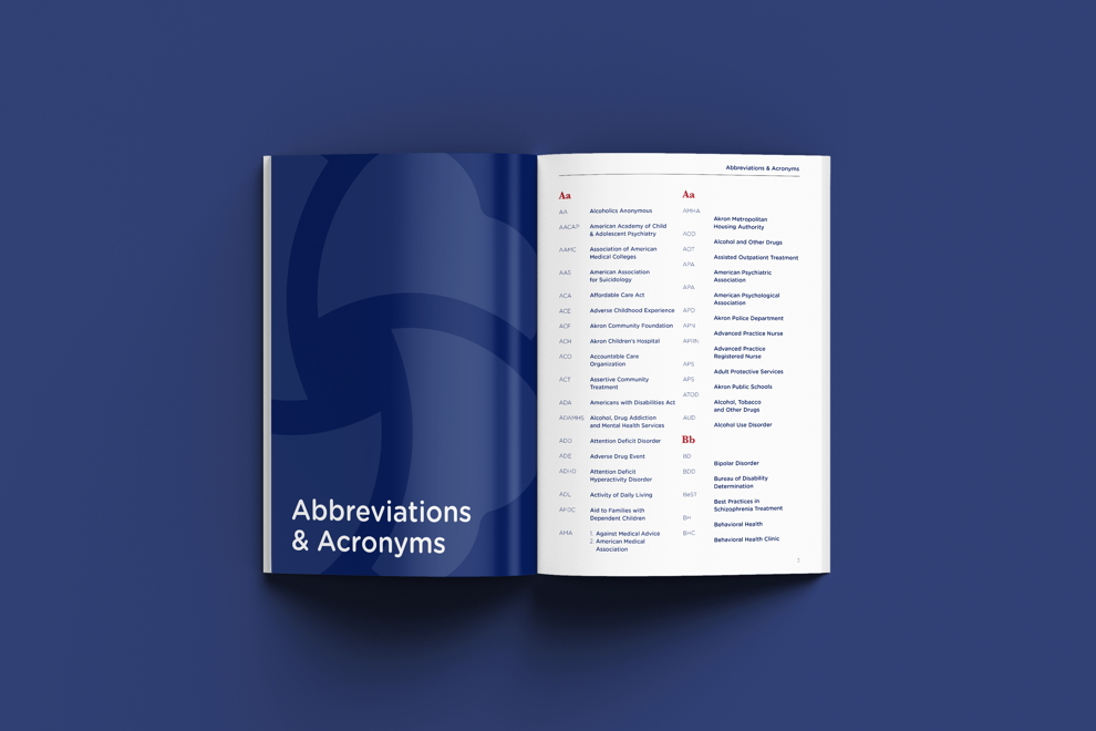
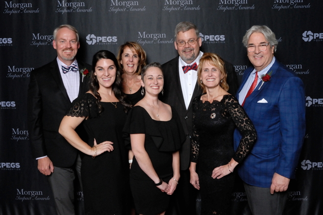
We also produced brochures, booklets, event invitations, and other print materials for the foundation’s annual Morgan Impact Awards event.
Response to our new brand has been overwhelmingly positive.
“ ”
Victoria Romanda, Chief of Staff
Peg’s Foundation
Regional foundation with a national feel
Peg’s Foundation’s new branding moved their image and work into alignment. Victoria reports that “public response to our new brand has been overwhelmingly positive.” Now, when people visit PegsFoundation.org, open Peg’s Foundation emails, or even receive an invitation to the Morgan Impact Awards, they feel like they’re interacting with a trusted brand.
Their new image promotes a sense of security with their partners that will help Peg’s Foundation continue to create a lasting impact in mental health across the nation.
